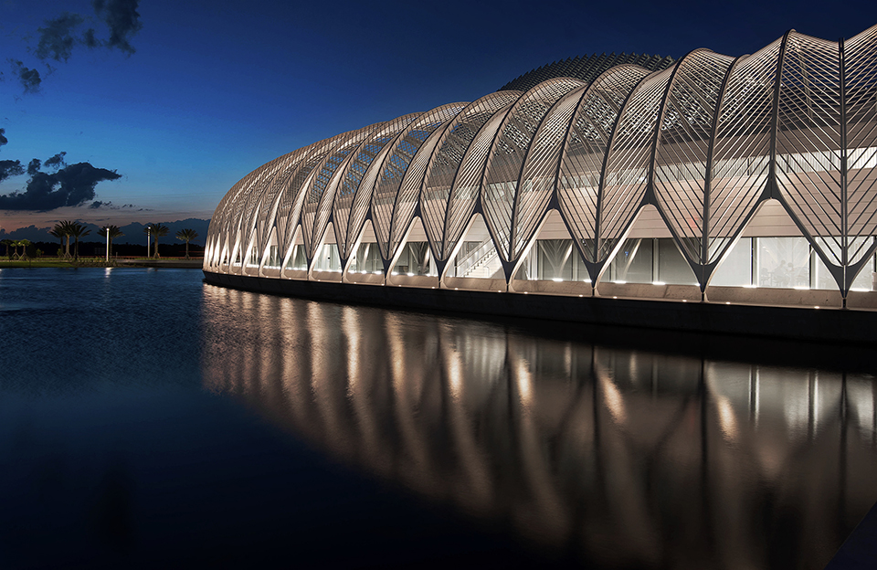
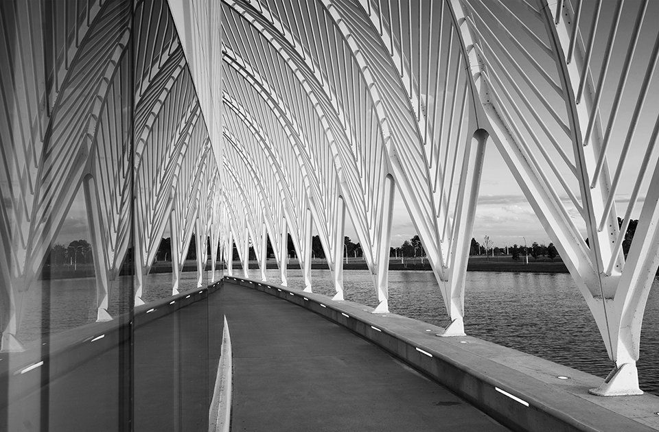
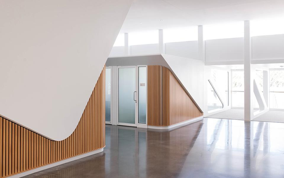
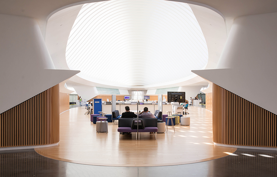
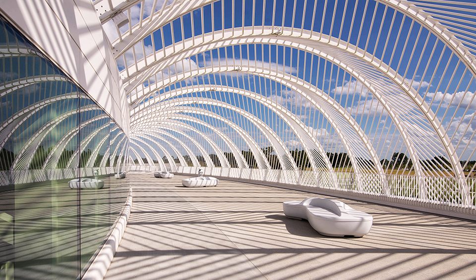
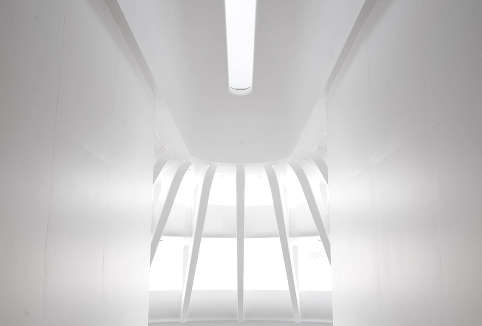
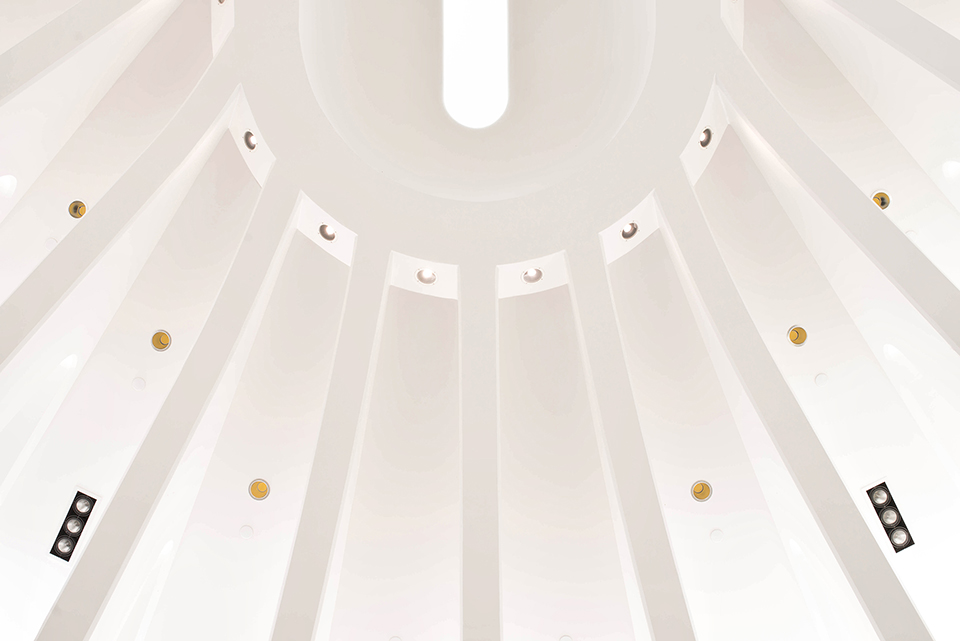
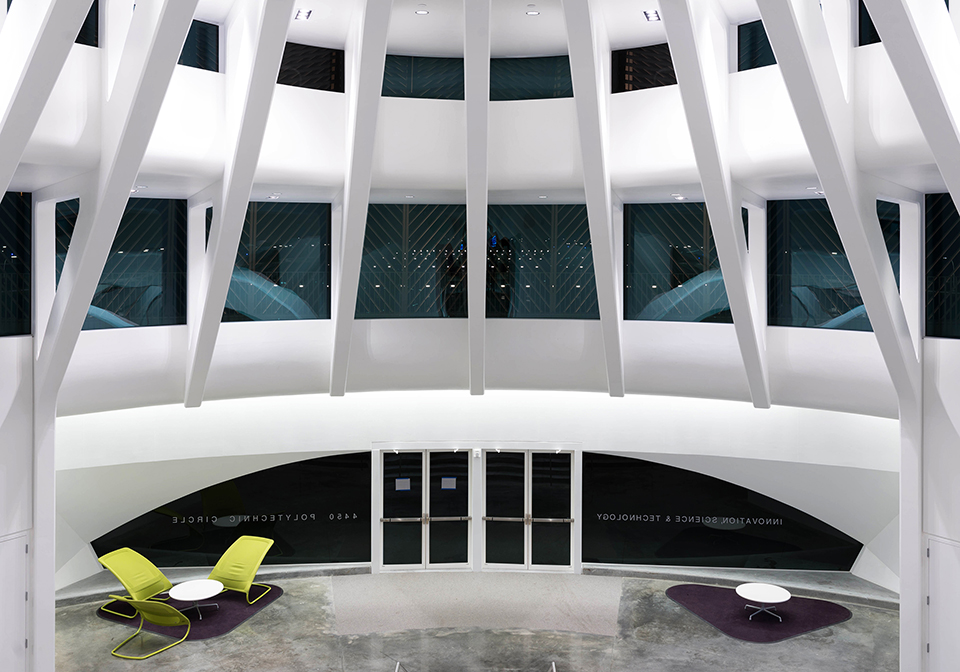
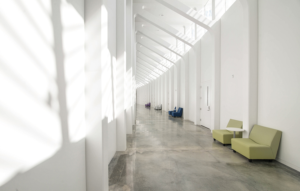
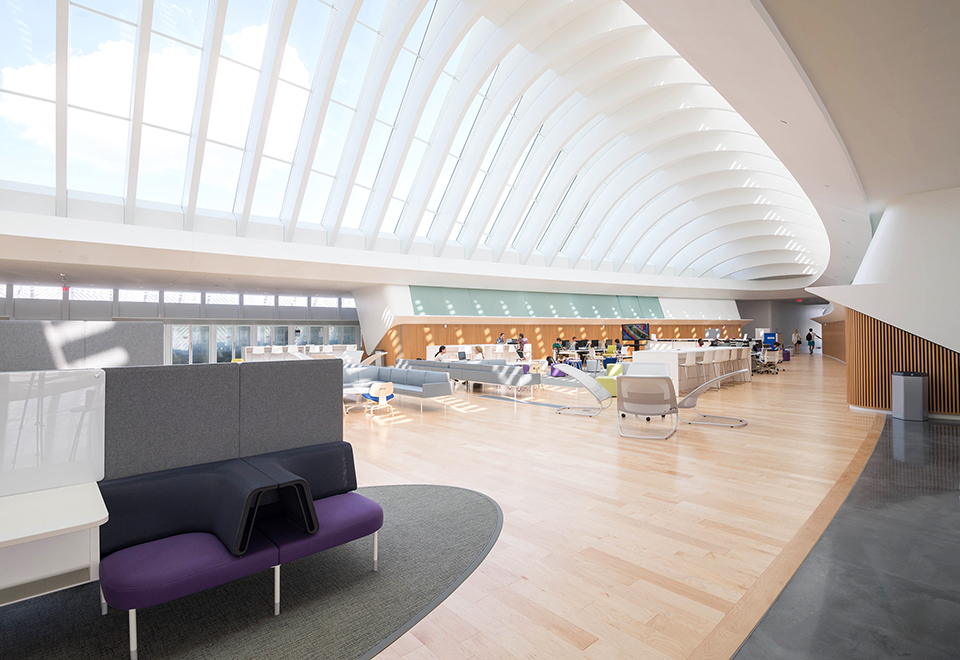
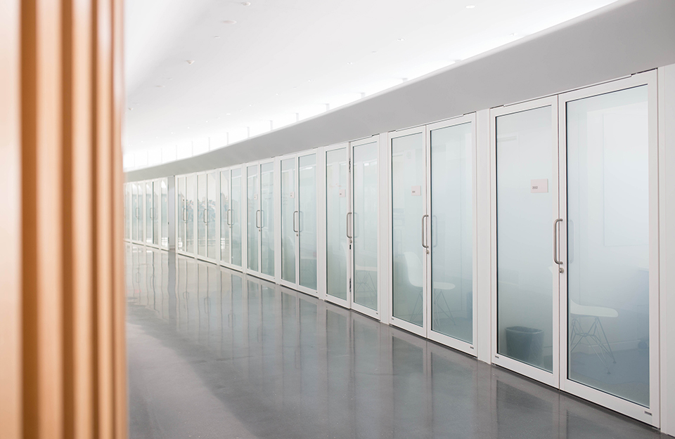
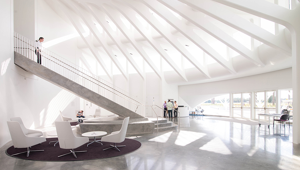
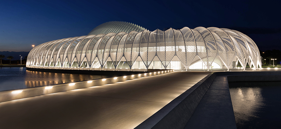
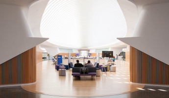
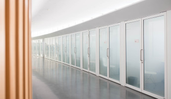
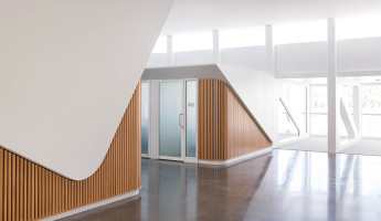
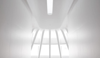
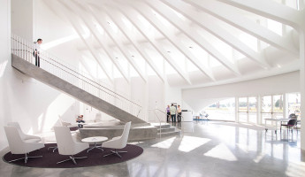
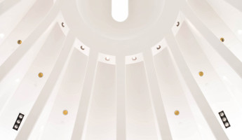
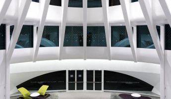
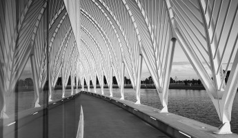
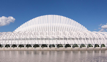
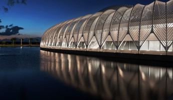
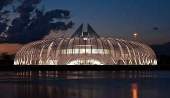
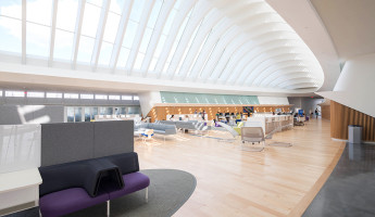
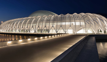
Florida Polytechnic University stands between Tampa and Orlando, a half-way marker amidst a hundred miles of farmland along Interstate 4. It seems to appear out of nowhere, an alien shape that dominates a landscape of farms, RV dealerships and theme park billboards. It is a magnet to the eye of every driver along busy I4, an advertisement of its own for bright, progressive thinking. At face value, it seems like an unlikely place to locate a bold new educational initiative, but like the building’s design, its location is carefully-calculated. Florida Polytechnic was built to attract the brightest young minds in technology and innovation from two of Florida’s fastest growing regions, Orlando and the Tampa Bay. Florida Poly will draw on the combined 5 million population of these regions, and its Lakeland, Florida address places it as a short drive from each metro area. While this university is just weeks into its infancy, its architecture stands as a visual advertisement on one of the busiest stretches of interstate in Florida. As a whole, Florida Polytechnic University is a master-planned design by the celebrated Spanish architect Santiago Calatrava. The first and only completed section of this plan is the IST Building, a structure that stands on the far end of the proposed campus. Its design is unmistakably the work of Calatrava, an architect whose signature is clearly exhibited in his works around the world, from Athens to Jerusalem to Rio de Janeiro. Calatrava won the bid for Florida Polytechnic in 2009, having shown a distinctive, remarkable and appropriate vision for the future of the university. While the exterior of the IST Building is sculptural in form, its interior architecture is functional, deliberate and impressive. The space and symmetry of the interior entrance has an almost spiritual appeal, where the sanctity of the building’s purpose is impressed upon the visitor. Calatrava’s role in the design of the IST Building isn’t only about structure and form, but about guiding the use of his building. His goal was to design a collaborative environment where students and faculty are encouraged to interact by the architecture itself. Above, a ring of faculty offices outlines a student center and virtual library. Each office is directly accessible to students, a matter of feet away from the common study hall in its center. The faculty offices themselves are almost prohibitively small, and decidedly so. There is space for the faculty member and a student, as gathering is encouraged in group meeting rooms directly across the hall. Offices are private, but to a limited extent– these offices are not enclosed from above, which allows sound to carry and encourages quiet use by each occupant. The grand study hall is inset within the ring of faculty offices on the upper level. Unlike the lower level, the walls of the study hall are lined with vertical slatted wood panels that act as both an acoustic barrier and a visual warming element. The sound proofing nature of these walls keep echoes to a minimum, allowing students to talk at casual levels without disturbing others. The natural color of the wood and the arching skylight above creates a peaceful, relaxed and warm environment for study. It is inherently communal, inviting students to group together with easy, direct access to faculty advisers on the room’s outer ring. The natural light that enters the IST Building is controlled by a set of “wings” that stand atop the structure. These wings lift and shift throughout the day, acting as a grand curtain above the building. It moves with the sun throughout the day, as one large panel rises in the morning facing the East, then shifts to the West as the sun completes its daily circuit. At dusk each day, these wings drop to their lowest point, standing as a steeple of sorts in the center of the building. In the daylight, the IST Building is much more a part of its environment. As the sun passes over head, highlights and shadows climb across the interior walls like a subliminal sundial. Nearly all of the public spaces are lit entirely by ambient light during the day, a cost-saving measure that also plays a role in the building’s emotional appearance. In the evening, artificial light provides a different perspective of the IST Building’s interior architecture. The progressive futurism of the design becomes more apparent, as the environment around the building disappears into darkness. The new mood is appropriate given the purpose of the building, as students see only the complex, rigid mathematics behind the building’s shape. This design is a philosophical match for the subject matter of its classes. Here, students study nanotechnology, machine learning, big data analytics and cyber gaming. On site, they are exploring practical applications of cutting edge technologies in hands-on environments. There are arrays of Makerbot 3D printers in one room, there’s an IBM Supercomputer in another– one of only two in public institutions in Florida. Students are learning about the technologies of tomorrow in a building that feels like it has arrived out of the future. It’s an inspiring learning environment, and this was a deliberate design decision by Santiago Calatrava. From a critical standpoint, I find the interior architecture to be the true story of Florida Polytechnic’s IST Building. It is functional, deliberate and impressive, imparting an educational spirit while guiding its guests through its halls. The architect’s emphasis on wayfinding, collaborative grouping and conduct for each space is remarkable. It is not a sculptural undertaking like its exterior– it is a decidedly functional environment that unconsciously guides its use. The exterior of the IST Building at Florida Polytechnic University has an important purpose of its own. It is a visual ambassador for the university, a point of introduction to the millions of drivers that pass by on Interstate 4 every year. It is a symbol for the university, and it will remain a symbol for as long as it stands. Its exterior shape is modern in spirit, but it does not quite feel like a 21st century design. The IST Building feels like an echo of 20th century modernism, a work that would be at home in 1990s Brazil, but a bit behind in 2014. Institutional, sculptural architecture has some freedom in the sense of era-based ambiguity, but it’s hard not to notice a bit of dated character in the building’s exterior. In total, the design of Florida Polytechnic University by Santiago Calatrava is a success. It will act as a bold visual ambassador that introduces the university to the public around it. Inside, its halls and public spaces have a clear functional design that encourages collaboration and conduct. For a state that is largely behind in modern architecture, the new work by Calatrava is a welcome sight. It is a welcome sign for the future of modern architectural investment by the state and its municipalities. – Photography and Text © Seamus Payne for TheCoolist.com –
Florida Polytechnic University by Santiago Calatrava | Gallery
