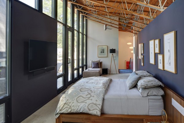
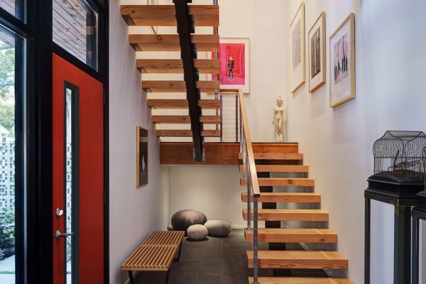
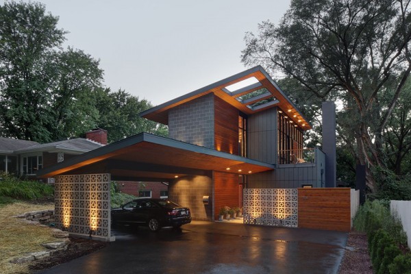
While the dark colors of the gray stone exterior are replaced with brighter whites within, the natural wooden accents remain. The angled ceiling on the top level features exposed trusses that add to the contemporary feel of the interior space. Large windows on the upper level climb from floor-to-ceiling, ensuring that lightness and warmth create a mood that permeates the home. The result is a home that avoids a common pitfall of contemporary design– a space that feels cool and confining. The design of this home, from architecture to interior furnishings, communicates comfort at every angle. The original home featured a courtyard as its centerpiece, and the new restoration continues this focus. The bottom level opens out into a private courtyard, and the upper level’s walk-out patio peers onto the courtyard below. This courtyard is split between a central section with a winding staircase to the upper level, an entry courtyard in the front of the house, and a disconnected vegetable garden with its own bit of privacy. Privacy is the focal point here, to provide personal space for entertaining and private reflection, a bit of peace from the outside world. This design by Bruns Architecture is a success in inspired restoration. The mid-century modern elements of this design remain very apparent, while the material and structural updates give the home a contemporary relevance. [architect: bruns architecture photographer: tricia shay via: archdaily]
Midvale Courtyard House by Bruns Architecture | Gallery


